

Dispositions Statements
The Policy Matters page is a separate page within the course introduction pages. This page can be replaced by the Teaching Dispositions Statement and the Nursing Dispositions Statement pages.
Dispositions statements: When dispositions statements are needed, include the following standard wording in running text, not in a frame as other outside links would be:
Please review the Statement of Teaching Dispositions.
Please review the Statement of Nursing Dispositions.
Formatting and Style
Emphasis: When it is necessary to emphasize text, rewrite the sentence so it focuses on the word or phrase. If it is necessary to have the emphasis, italics should be used instead of bold or quotation marks. To meet accessibility standards, italics should be used sparingly, and information that is important to the student should be in a callout or new paragraph.
Hyperlinks: When including hyperlinks in a sentence, write the sentence as you normally would, and link relevant keywords. Do not include URLs in the text. Avoid wording that includes instructions like "click here" or "found here." If using the title of the resource as the hyperlinked text, make sure the text matches the exact wording of the title of the resource and the link goes to where it says it does.
Example:
Learn from WolframAlpha and Computable Documents, which allows you to use interactive demonstrations.
Do not include articles (e.g., the, a, our) in the linked text unless it is in the title of the resource. Do not include terminal punctuation or quotation marks in the linked text.
Resources without a title: Use descriptive wording of the linked item as the hyperlink only when no specific title for the linked item is given.
Pronouns: First-person pronouns should be avoided, except in very rare instances (e.g., quotations, scenarios). Refer to the student in second-person singular (i.e., you). Within a given section of a course, make sure the use of either second person or third person is consistent.
Punctuation: Use "straight" quotation marks and apostrophes rather than curly ("smart") quotes. Doing so will help prevent display problems on certain devices.
Dialogue and quotations: Dialogue and quotes in course material are exempt from rules concerning first-person language and contractions. Dialogue should be used sparingly and should be set in roman and in quotations. To properly format quotes and avoid plagiarism, see the American Psychological Association's guidelines.
Titles
Multipart modules, pages, or lessons:
Pages that are part of a multipart series should be titled with numerals (e.g., Lesson 1.1: Communication Strategies).
References to Other Sections of the Course: References to other sections of a course, especially when they are generic, should be limited as much as possible. When doing so, include the full title on the first instance. Use headline style for the title, and hyperlink the title to the chapter or section. In subsequent usage, it is acceptable to include only the relevant term (e.g., lesson, section) and the associated number.
Examples:
Lesson 5.4: "Setting Team Goals" discusses. . . . Lesson 5.4 also discussed SMART goals.
Use the Preparing for Success section.
Abbreviations
Spell out the first appearance of a term in each module or lesson. Spell out the first appearance of a term in each formative item.
Headings: If the first appearance of the term is in a heading, do not include the abbreviation in the heading. Instead, place the abbreviation in the first appearance in the text.
Glossary and key terms: The term should be written out and include its abbreviation in parentheses, except for those commonly abbreviated terms.
Terms and Definitions
In-Line Formatting
Bold the first instance of a key term. The term should be defined in a key terms list on that same page.
Glossary and Key Terms List Formatting
Lowercase the key term unless the term is a proper name. Use italics only if the term is always italicized. Because definitions should be incomplete sentences, do not start the phrase with an initial cap or end the phrase with a period unless grammatically correct to do so. Definitions should not be bolded.
- This section usually appears at the bottom of the page where the term appears, before the Attributions and References component. Title the component “Key Term” (or “Key Terms” if more than one term).
- Terms should appear in the order they appear on the page.
- The list of terms should be bulleted.
- The term should be bolded, followed by a bolded colon.
Tables
Tables are one of the most useful tools for organizing data
Use tables only to present data or simple relationships — never for visual layout, spacing, or to recreate a design grid. Using a table for layout breaks the reading order for screen reader users, who will hear table navigation cues ("row 1 of 4, column 2 of 3") around content that isn't actually tabular data. If you need a layout grid, use the OEX’s layout and column tools instead.
A table should communicate one primary idea clearly. If you're trying to show a process, a hierarchy, or a complex relationship, an infographic, diagram, or list may serve learners better than a table. Tables give structured row/column relationships and are resizable, selectable, and screen-reader navigable, but visual relationships and multi-step processes are often clearer as an illustration.
- Keep cells concise: limit to 1–2 lines, ideally under 12–15 words. Use short phrases, not full sentences.
- Avoid large blocks of text in a cell because it disrupts reading flow for everyone, and is especially disruptive for screen reader users. Move detailed explanations below the table instead.
- Left-align text; center-align dates or numbers for easy comparison. Don't mix alignments within the same column.
- Aim for 5 columns or fewer. If you need more, split into multiple smaller tables rather than relying on horizontal scrolling.
- Use bold or color sparingly to highlight key data; don't overuse alternating row colors, which creates visual noise.
Table frequency: 1–2 tables per screen is ideal; 3–4 per page is fine if each serves a distinct purpose; 5+ on a single page risks overwhelming the learner.
Building Accessible Tables in OEX
Keep the structure simple. Complex tables, multiple header rows, excessive merged cells, or tables trying to communicate too many ideas at once create real barriers for screen reader users. If a table is getting large or hard to follow, split it into multiple tables or consider a list instead.
Header cells must be set individually.
- Select the individual header cell → right-click → Cell Properties
- Change Cell Type to Header Cell
- Set Scope to Column (for a header row) or Row (for a header column)
- Adjust alignment if needed
- Under Advanced, apply your background color
- Save and repeat for every header cell individually
Important: OEX's Row Properties "mark as header" shortcut does not create properly associated header cells. Each one has to be done through Cell Properties.
If your table uses both row and column headers, the empty cell where they intersect (top-left) should stay a normal cell. Don't convert it to a header.
Every table needs an accessible title. Right-click → Table Properties → check Show Caption → enter a clear, descriptive title. This lets screen reader users know what the table contains before they navigate into it.
Formatting for readability: Set cell padding to 10px so content doesn't feel cramped. Use top alignment (vertical) and left alignment (horizontal) in most cases — this is a shift from previous guidance to use middle alignment, since middle alignment creates uneven gaps when cell content varies in length. Table padding must be adjusted manually; it isn't set by default.
Colors: Use only the core WGU colors and their designated 80% tints, which were built specifically for tables (Blue Midnight, Stone, Ocean, Fuchsia, Teal, Amber, Clover, Crimson, Rust). Table type determines placement — horizontal highlight (top row filled), zebra stripe (top row + alternating rows), vertical highlight (left column filled), double-emphasis (top row + left column), or comparative (unique colored columns, used sparingly).
Building Accessible Tables in Word
- Insert tables using Insert → Table → Insert Table. Never draw tables — drawn tables don't carry the same structural markup.
- Under the Table Design tab, ensure Header Row is selected, and First Column where appropriate.
- Write clear, concise column headers that accurately describe the data below them.
- Avoid complex structures: no merged or split cells, no nested tables. If the data is genuinely complex, split it into multiple simpler tables.
Add a caption: References → Insert Caption, with a descriptive title explaining what the table shows.
Titles, Captions & Labels
• Every table needs a clear name or label so learners and screen reader users know what they're about to navigate before they reach the first cell. Labels should be descriptive and specific.
• In Word, add this using References → Insert Caption, with a descriptive title placed before the table — not just a bolded line of text above it.
• In OEX, label tables using the H6 header style in the format “Table: <Table Name>.” Use a specific, descriptive name (“Table: Enrollment by Region”) rather than a generic one (“Table: Data”).
• Don't rely on numbered labels for tables and figures — unlike sequential numbering, descriptive names don't need to be renumbered every time content is reordered, added, or removed.
• Alt text and captions should complement each other, not repeat the same words: the caption names the table, and alt text (where used) should describe what the table shows.
Core Accessibility Requirements (WCAG)
These apply regardless of platform:
- Table titles (1.3.1): Every table needs a clear, programmatic label (an HTML <caption> or equivalent) so users know what the table is before navigating its cells.
- Layout vs. data (1.3.1 / 1.3.2): Never use a table for page layout. Use CSS/layout structure instead, so meaning, relationships, and reading order stay clear for screen readers.
- Header association (1.3.1): Header cells must be programmatically tied to data cells — <th> with correct scope (or id/headers for complex tables) and <td> for data. This is what allows assistive tech to announce the right header context as a user moves through cells.
- Reading order (1.3.2): If a cell contains links or buttons, make sure the table's content still reads in a logical, linear order.
- Reflow/zoom (1.4.10): Tables shouldn't require two-directional scrolling at small widths or up to ~400% zoom. Use responsive patterns — stacking, wrapping, or an accessible scrolling container — rather than forcing horizontal scroll.
- Color cues (1.4.1): If color is used in a table (e.g., red/green status indicators), never rely on color alone — pair it with text, an icon, or a pattern.
Capitalization: The column and row headings of the table should be in headline style.
Abbreviations: There should be no abbreviations in a table, figure, or graph unless they are well established within the surrounding text, or they are industry-wide terms (such as BP for blood pressure or GDP for gross domestic product).
Symbols: In columns that have the same sign or symbol for each value (such as with percentages or dollar signs), the value should be placed in parentheses following the header as part of the column head. Where space is at a premium, it is okay to put symbols in parentheses following the row headings. Otherwise, include the symbol on each entry.
Images
Images can clarify a process, anchor a concept, or reinforce a key idea faster than text alone. Use images sparingly and only when they convey meaningful information that supports the content. Every image should do instructional work and not just fill space. Avoid decorative overuse. If an image doesn't add instructional or informational value, leave it out. Images are instructional tools, not decoration. When a design is clean and purposeful, learners can focus on the content instead of the visuals. Sometimes the best choice is not using an image at all.
Choose high-quality, accurate, authentic images. Avoid blurry, cluttered, overly posed, or clichéd stock visuals, and favor images that reflect real learning environments and the diversity of WGU's learners.
Placement and Formatting
Ensure all images are in line with text. Do not use floating placement for anything that carries essential meaning.
Do not use Shapes, SmartArt, text boxes, or floating objects to convey essential information. These are inconsistently exposed to assistive technology and easy for a screen reader to skip entirely.
Floating/inline-with-text placement is only appropriate for simple or decorative images. These can sit alongside body text without requiring focused attention.
Instructional or complex images such as charts, diagrams, screenshots, or any image containing text or labels need their own line/block, not a floating wrap, so learners get a clear, undistracted view.
Alternative Text
All meaningful images must include alternative text so the information is available to screen reader users. Every image must have an alt attribute including an intentionally empty one for decorative images.
Alt Text Guidance
• Write alt text that is clear, grammatically correct, and informative.
• Describe the purpose and meaning of the image, not just its appearance — say what it communicates, not what it looks like.
• Keep alt text concise: one to two sentences, roughly a 125–150 character target, unless more detail is genuinely necessary for understanding.
• Provide a fuller description when the image is instructional, analytical, or data-driven (charts, diagrams, process visuals) — but keep that detail in a long description, not crammed into the alt text itself. A long, detailed alt text forces screen reader users to sit through an announcement before every line of following text.
• Mark purely decorative images (borders, dividers, visual accents) as Decorative so they're skipped entirely, rather than giving them a description.
• If text appears in an image, repeat that text in the document body. Do not rely on an image as the sole method of communicating that text.
• Avoid using images to present text unless the same visual effect genuinely can't be achieved with real text (HTML/CSS). This applies even to content like logos or branding
• In Word, select the image and right-click, choose “View Alt Text” and enter the description in the Alt Text panel.
DAMS and OEX
• Label images using the H6 header style in the format “Figure: <Figure Name>.”
• Use a specific, descriptive name (“Figure: Stages of Moral Development”) rather than a generic one (“Figure: Diagram”) — descriptive names double as a memorable anchor for the concept.
• Skip sequential numbering for image labels. Descriptive names don't need to be renumbered every time content is reordered, added, or removed.
• Keep alt text and the visible label distinct: the label names the figure, alt text (or long description) describes what it shows.
• In DAMS, use the “Accessibility Long Description” field.
• In OEX, use “Long Description.” In OEX, don't use image captions as a substitute for alt text or long descriptions. A caption is a visible label; alt text and long descriptions are what assistive technology actually reads. Use the correct field for each.
Keep Images Reusable
• Avoid embedding identifying information in course-level image assets including school names, program references, course numbers, legacy logos, unless explicitly required. This keeps assets reusable across programs, colleges, and future revisions.
• If institutional branding is required, use only the official WGU logo in its standard blue or white version, not school-specific or legacy variations.
External Readings and Videos
Hyperlinks: The title of videos that cannot be embedded and all external readings should be hyperlinked in the instructions. Do not include quotation marks, parentheses, or terminal punctuation in the hyperlink. An icon indicating the link opens a new tab is automatically added to the hyperlinked title, and closing punctuation should follow this icon.
Readings and video titles: Titles should be in headline style regardless of the original title capitalization and formatted with italics or quotation marks as appropriate for the resource (e.g., book, chapter, article, journal, magazine, video). If the learning resource has a spelling error in the title, this should be fixed. All other formatting should match the source title (e.g., colons, hyphens).
Content description: Each activity (e.g., reading, video) should include a brief description or synopsis of the content to let the student know what the content will cover and what benefit it may bring. This content should be original and not taken directly from the text of the reading or video.
Grouping: Designers may group closely related resources together in the same box. Use a bulleted list that hyperlinks the individual sections, and write a brief description that applies to all the readings or videos.
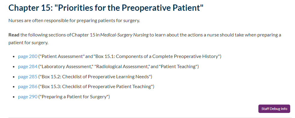
Links: Links to external readings should go directly to the section or page indicated whenever possible. Hyperlinked text within the instructions should align with whatever portion the student is expected to read. For example, if students are to read pages 99–102, hyperlink "pages 99–102" (do not hyperlink the quotation marks). Keep the amount of hyperlinked text as limited as possible.
Title—book: Include the chapter number and chapter title. Place a colon after the chapter number and quotation marks around the chapter titles.
Book chapters: Capitalize chapter, and hyperlink chapter and the chapter number only. The book title should be italicized and follow headline style. Do not include the chapter title in the instructions; it should only be in the heading of the activity section.
OEX:
Read Chapter # in Book Title.
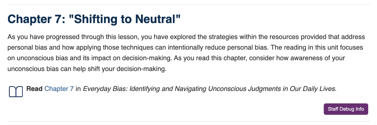
Pages and sections: Refer students to section titles whenever possible to guide their reading. When using section titles, place them in parentheses and the titles in quotation marks. If there are no corresponding section titles for the reading selection, use the page numbers only.
In all cases, hyperlink the page range only, use numerals, and lowercase the word page. When giving a page range, use an em dash (–) and not a hyphen.
OEX:
Read page # ("Section Title") in Book Title.
Read pages #–# ("Section Title") in Book Title.
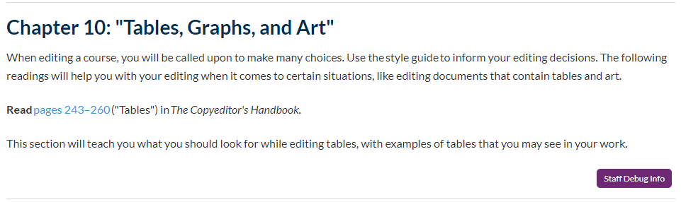
For readings across more than one section, use the phrase to the end of between the section titles, and italicize it. If the reading begins on the first page of the chapter, which has no separate section name, use the chapter number in the parentheses.
OEX:
Read pages #–# (beginning of Chapter 5 to the end of "Section Title") in Book Title.
Read pages #–# ("Section Title" to the end of "Section Title") in Book Title.
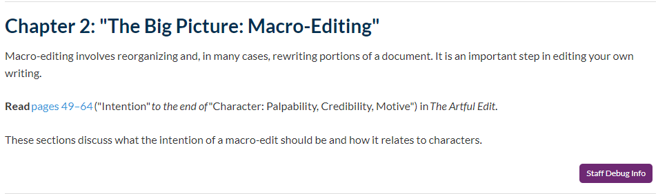
Title—article: Include the full article title in quotation marks. Use the (lowercase and Roman) only when it is part of the title.
Online article: The synopsis of the article includes the article title and the resource it was published in. Hyperlink the article title (do not hyperlink the quotation marks). Use the official periodical name, website, or resource title where the article was published. Use the original publication or reputable websites whenever possible.
OEX:
Read the article "Article Title" from Periodical Title.
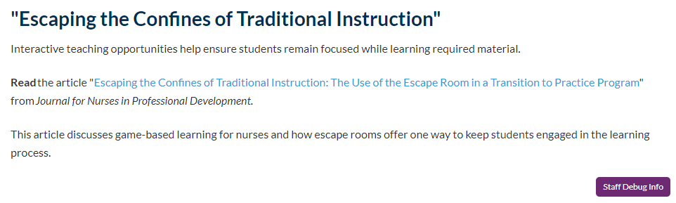
Title—website: Include the official website name, even if you are referring to a specific web page for reading. Remember, web pages are the various pages that compose the larger website.
Activity headings: If the reading is specific to one web page, use the title of the web page as the title of the activity. Otherwise, use the website title as the title of the activity.
General reading or review: When students are not required to read a specific section of a website but rather are asked to explore or scan website content, use the word review within the instructions. Hyperlink the official name of the website or web page.
OEX:
Review the information found at "Web Page Title."
Review the information found at Website Title.
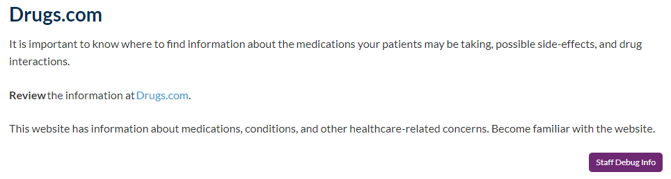
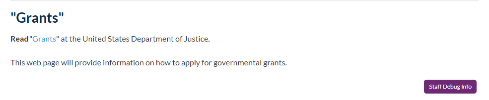
Specific reading: If the reading is directing students to a specific website page, put the page title in quotation marks, hyperlink the title (not the quotation marks), and include the official website name.
OEX:
Read "Web Page Title" at Website Title.
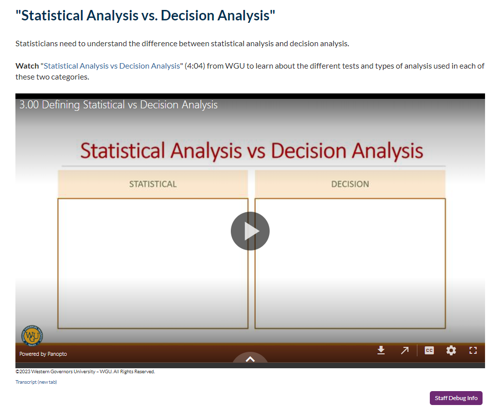
Links: Some videos should not be embedded in a course for legal and copyright reasons. If a video should not be embedded in the course, the title of the video should link to the video, and the video itself would not be embedded in the activity.
Introductory sentence: The sentence introducing a video should include the title of the video followed by the length of the video ([hours]:[minutes]:[seconds]) and the source it comes from. If the video comes from a streaming service, include the name of the service the video is on or the username associated with the video as it is stated in the source. If it comes from a website, use the name of the website instead. Be as specific as possible so the student would be able to find the video on their own if necessary.
OEX:
Watch "Video Title" (hours:minutes:seconds) from Username.
Watch "Video Title" (hours:minutes:seconds) from Website.
Links: If the audio clip is hosted on a website, link the title of the clip to the site, even if the audio clip is also embedded in the activity. Note that some audio clips may not have a source site (e.g., some podcast episodes are hosted on many platforms and do not have a home site). In this case, do not hyperlink the title. Whenever possible, also include a link to the audio clip transcript (see the example below).
Introductory sentence: The introductory sentence should include the title of the audio clip followed by the length of the audio clip ([hours]:[minutes]:[seconds]) and the source it comes from.
OEX:
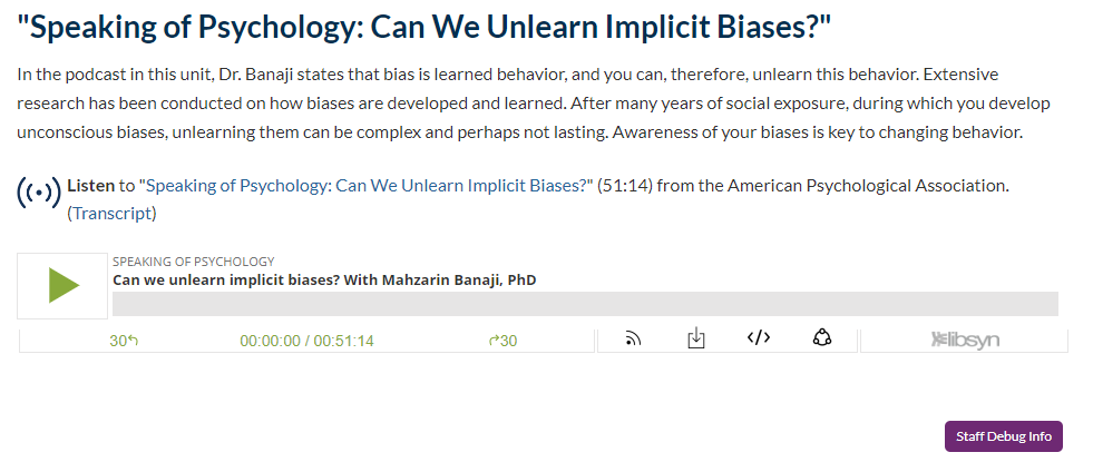
Listen to "Audio Clip Title" (hours:minutes:seconds) from Source Title. (Transcript)
The Role of AI Generative Content
Artificial Intelligence (AI) is used as a support tool throughout the design and development process, helping with brainstorming, drafting outlines, generating examples, and improving clarity, but it never replaces human judgment or makes final decisions. All AI use must go through WGU-approved tools, such as the WGU ChatGPT account and its collection of approved custom GPTs or WGU Claude and approved projects, which help keep content aligned, in scope, and in the right voice and tone. Designers and developers remain fully responsible for the accuracy, quality, accessibility, and alignment of anything AI helps produce, and all AI-generated content must be carefully reviewed and revised before use. Raw AI output should never be pasted into team documents as a placeholder.
AI is also used carefully with copyrighted or licensed materials: licensed learning resource content (e.g., EBSCO, ProQuest, McGraw Hill, Wiley) must never be entered into AI tools, and any sources AI suggests must be independently verified before being cited.
AI can support image ideation, but AI-generated images are never uploaded directly into DAMS since WGU can't claim copyright ownership without human adjustment, and only Synthesia is currently approved for AI-generated video. Effort must begin and end with human judgment. AI accelerates the process, but people own the outcome.
AI imitates the patterns of "good writing" without understanding purpose, which often results in prose that is grammatically correct but stylistically inflated and emotionally flat. Never copy-paste AI output directly into course materials. Instead, edit every draft using the FRESH-S approach: Focus on the core message, Read it aloud to catch what sounds unnatural, Eliminate filler (cut hedging phrases like "it is important to note that," "plays a crucial role," or "in today's fast-paced world"), Simplify without dumbing down, Humanize the tone, and Standardize formatting for consistency. Watch especially for AI's telltale habits: vague, overused verbs (utilize, leverage, ensure, robust), unnecessary contrast framing ("not only...but also"), overused transitions (additionally, furthermore, moreover), excessive em dashes, and serial lists that bury the main point instead of stating it directly. A simple test: if you wouldn't say a sentence this way to a student or colleague, rewrite it. Editing AI output should be part of instructional design itself, since clarity and tone directly affect learner comprehension, assessment validity, and learner trust. Human review is what allows WGU to claim ownership of the final content.
Formative Assessments
Formative assessments are the low‑stakes, nongraded practice items WGU builds into every course so students can check their own understanding before they hit the high‑stakes summative work (OAs or PAs). They differ from summative assessments in that they don't count toward a grade. Their job is to help learners gauge progress and catch gaps early. Formative assessment types include multiple choice, true/false, multiple select, short answer, submit-and-compare, and AI evaluation.
More information about the types of formative assessments available in OEX, including how to format them, can be found on the "Formative Assessment in OEX" page of the WGUx site.
Every multiple-choice formative item must include a rationale for each answer option, whether correct or incorrect. Other types of formative items should also provide learners with feedback on their response.
For accessibility, formative assessments should follow the POUR principles (Perceivable, Operable, Understandable, Robust) especially, when building assessment content with images, tables, or media:
Perceivable – any video needs captions, transcripts, and audio descriptions; images need alt text (concise, under ~125 characters, no "image of..." phrasing) and, for complex instructional images like charts or diagrams, a longer text description beyond the alt text.
Operable – interactive elements must be usable by keyboard alone.
Understandable – assessments should use plain language, proper heading hierarchy, high contrast, descriptive link text, and should not use color alone to convey meaning.
Robust – tables need header rows identified, and any PDFs need to be tagged for screen readers.


